
Introduction handyShop
When developing the theme the goals were:
- Enable quick launch of a catalog or store;
- Give the theme a pleasant look and core features;
- Keep everything at hand.
HandyShop is a ready-made theme for an online store or catalog. It is based on the magicThemes mini-engine and lets you build a catalog or online store with miniShop2 without deep MODX Revolution programming.
The theme is fairly universal and can fit almost any area that does not need complex functionality. See the Features section for what is supported. You can also view the demo site.
The theme will be developed and improved. Feedback on any aspect of this package is welcome.
Required skills are modest: basic css + html + Bootstrap 4 grid (flex). You should have at least basic MODX knowledge. Currently the target version is MODX 2.8.x.
Core skills:
- Install MODX on hosting and install packages.
- Configure friendly URLs and alias transliteration (Translit package).
- Understand system settings: find and change the needed setting.
- Create resources, templates, and TV fields (and bind them to templates); assign resources to templates; configure the file source.
For comfortable content management it helps to know:
- Collections package (for resource lists outside the tree) and its setup. Simplifies document navigation and clean resource lists.
- Translit package converts resource alias to transliteration on save (automatic).
- MIGX package for simple and complex data in table form: e.g. photo galleries, contact lists, social links for the site.
- For visual content editing: TinyMCE Rich Text Editor v2.x or CKEditor 1.4.x.
- For code editing when needed: ACE v1.9.x.
- For inserting photos and galleries into content: imgsPaste (paid); useful mainly for the News/Articles section.
If you need to extend the theme on your own, requirements increase (php, fenom, js, css, html, magicThemes, MODX API, etc.).
Features
Supported
Theme supports miniShop2 4.x and its store logic.
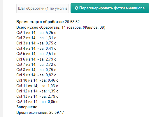
Photo regeneration in miniShop2 manually. After installation an item appears in the MagicThemes menu. 1 step = 1 product. Do not set very large values; regeneration can be resource-heavy on some hosts. Example: 14 products (39 photos) processed in 25 sec. The script shows start and end time and time per product. If regeneration is interrupted (e.g. browser closed), run it again and it continues from where it stopped.
For product lists you can configure how product options are shown per category: as info or as add-to-cart choice (color, size, etc.).
On the product page: show key options above the Add to cart button; other options in the specs block (all filled options), Description area for product description and specs.
For categories with products: category image, image crop style.
Template for News or articles; can be used for promotions.
Plain template for simple text pages.
Template for Contacts: widgets for contacts, contact form, map, text.
Template for search or filter results by product options. Simple search by exact match. Filtering is configured in the admin; see the Pages section.
General
- Change site-wide color scheme or per-section. Match your brand color.
- Change font and size site-wide.
- Adjust styling of elements and thumbnail sizes for a unique look.
- Add blocks, reorder them, use a 3-column layout.
- Slider has minimal settings for quick commercial use.
If the theme fits you and you need a specific feature, ask the developer whether it is available.
The theme will be developed and improved. Do not hesitate to send feedback and suggestions.
Installation and setup
Dependencies and requirements
Packages that must be installed before installing handyShop. Without them the theme will not install. All are free:
- php >= 7.2, < 8 (dependency)
- MySQL 5.7 or MariaDB (database)
- MODX >= 2.8.0 <= 2.8.4 (3.x not yet supported)
- pdoTools >= 2.12.10
- minishop2 >= 3.0.7
- MagicThemes >= 1.0.0
- phpThumbOn* > 1.3.3
- MIGX* >= 2.13.0
- MobileDetect* >= 2.0.2
- SuperBoxSelect >= 3.0.7
- ColorPicker >= 2.0.4
- FormIt >= 4.2.6
- AjaxForm >= 1.2.1
Внимание
Installation assumes a clean system, but you can install on an existing project to switch themes. Do this on a backup copy. Changing the theme is usually not quick or simple and requires stronger skills.
Installing the handyShop theme
1. Install all dependencies
Before installing the theme, install the MagicThemes package. It needs no special setup; it installs its plugin and is ready to use.
2. Preparation
Before installing the theme you have the main page resource and a template. To keep the template, set up template matching before installing the theme.
Open the template and in the template code field (clear any existing code) paste:
{include 'file:default/corex.tpl'}Open the PARAMETERS tab, click DEFAULT PARAMETERS LOCKED, then CREATE PARAMETER. Fill in:
Name: match; Value: index, main; Click Done and Save.
When you install the theme, this template will be used for the main page. Rename the template so you know it is for the main page.
If you already have templates for the future catalog, set matching the same way. MODX template documentation describes matching in detail.
3. Install the theme
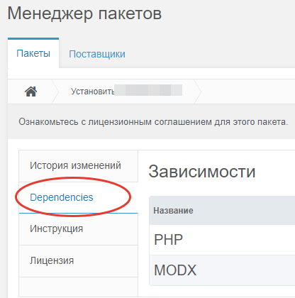
Download and install the theme. It is a normal MODX transport package. On install the theme checks for required packages and, if any are missing, shows requirements in Dependencies.
During installation the system writes and copies data to the right places. Progress is shown in the console.
4. Activate the theme in settings
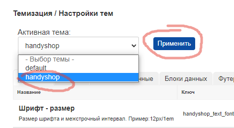
After a successful install, go to theme settings, set the active theme to handyShop, and click Apply. The theme is active; you can start creating resources for the catalog.
At this point the main page should already have the area structure.
Configuration
With default settings the site can already work; you only need to create resources, assign templates, set TV values, adjust theme settings, and configure widget output. Below we go through it step by step.
1. Creating resources
Process is simple: create resources and assign the templates that came with the theme.
1. Main page
Open the default main page resource. You can remove the content text right away. Go to the TV / ADDITIONAL FIELDS tab. TVs for common blocks for this page are already there.
Slider – your slider for the main page. You can assign this TV to other templates and use the slider on other pages with their own settings.
TV Product categories for page – choose which categories to show on the main page. You can change order and which categories to show.
TV Products for featured block – choose products to show in the product block.
TV Resources for featured block (News) – same idea for the News section.
2. Catalog
Create a Catalog resource and assign the CATALOG MAIN template. It shows catalog categories and subcategories.
3. Category
A category nested under Catalog, e.g. Clothing.
Create a resource under Catalog – a product category. In resource settings set resource type to PRODUCT CATEGORY and template "Catalog. Product list.". Save and open TV / Additional fields.
Here you can upload a section image and set image cropping.
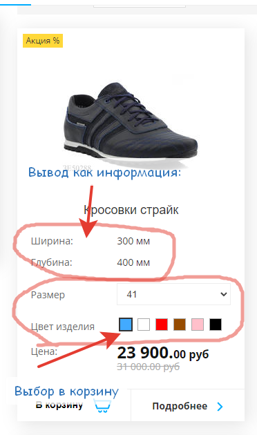
TV Options (key) – options to show on the product page near the price, as a list.
TV Options for add to cart. These are option selects that must be sent with the order (no price change) so the manager knows e.g. color or size.
TV Options for product lists. Shown in product lists for important specs.
These 3 TV settings for categories are inherited up the tree. You can set them per category or leave inherited.
4. Products
Create a few products in categories. (Template is assigned automatically; if not, check miniShop ms2_template_product_default and set the template.) In additional fields you only have crop type for the main image (used for custom product display).
!Important. Specs and parameters are filled only via options:
On the product properties tab there is a Colors field. It is better not to use it: it is limited, and miniShop (in newer versions) has a new option type – Color in options – with a preset palette and your own color names. The theme supports this new type.
Fields Size, vendor, country, tags – use as needed.
Checkboxes New, Special (recommended), Popular (Hit) – work as usual; labels are shown as small icon+text on the product.
If OLD PRICE is set, the product shows a “Sale” label.
All data used for filtering (in the future) is entered via options.
!Important. Filtering by TV parameters via Widgets is not supported in this theme!
5. Catalog with filtered products
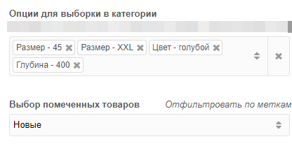
For SEO there is the template Catalog. Configurable product lists. On such a page you choose option values; only products with those values are shown. A mini-SEO resource similar to the well-known package.
TV Options for selection – choose option–parameter pairs. You can combine several. Choose parameter(s) and value(s) and add only new rows (see image).
You can build pages for new items, hits, recommended, etc.
Resource type can be a normal resource. It is not tied to categories; it is better not to make it a miniShop category to avoid confusion.
6. Simple text pages
For plain text pages use the Plain page. Text template. You can add a gallery, product list above or below the text via widgets. See magicThemes docs.
7. News or articles
For News or articles use the News. List template. For a single article use News. Single. The single-article template has a MIGX photo gallery and main image cropping.
8. Contacts
For the contacts page use the Contacts template. Widgets handle phones, address, map, text, contact form.
9. Search
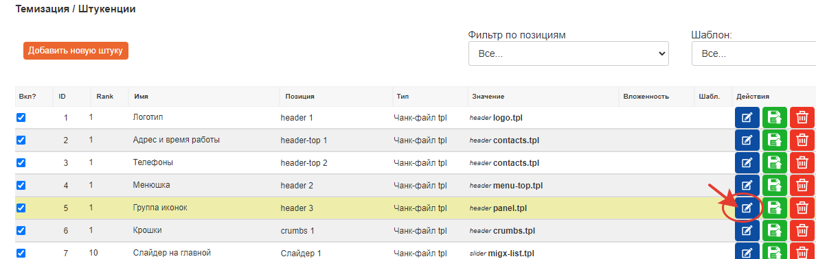
Simple site search uses the Catalog. Configurable product lists template. Create a resource Search results, assign this template, save. Put this resource id in the search icon widget. Header/panel.tpl
A popup will open:
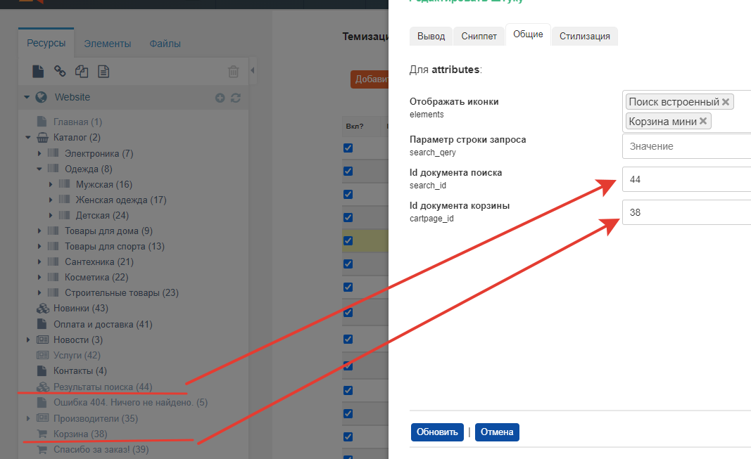
For the cart you can fill the id later when you create that page. Create it with the Cart template. Then create a Thank you / Order confirmation page with the same Cart template.
2. Configuration and understanding areas
Briefly: the engine uses virtual horizontal site areas. Think of header, content, and footer – 3 areas. The header area outputs the site header everywhere, footer the site footer, and the content area is different per page and contains widgets assigned to that area and template.
This theme has 8 areas:
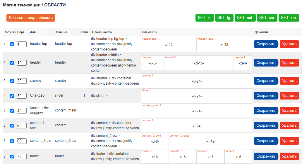
Each area is split into cells (positions), numbered 1–24.
E.g. top header has 2 cells, main header has 3. Each area uses a 24-column grid; for each breakpoint you can set Bootstrap padding, visibility, order. You can assign templates per area (rarely used; available as a field).
After changing data, save the row.
header-top – Top of header. Contact info, small menu, message, etc.
header – Main header. Usually logo, menu, search icon, cart, account link, etc.
crumbs – Breadcrumbs and H1.
slider – Slider. Dedicated area for the slider.
content_main – Single-column area for pages that need one column without wrappers (e.g. main page, article list).
content – Single column with wrappers. Used here for news list and single news.
content_2row – Two columns. Main content: product categories, contacts – anything that needs 2 columns.
footer – Site footer. 4 columns: logo, 2 menus, contacts.
You can add your own areas (e.g. 3-column layout) and assign widgets to them.
You can set classes on areas and on cells. Split areas into cells within the 24-column system and configure cell behavior for desktop, tablet, and mobile.
3. Widget configuration
Widgets are the main building blocks. They render and configure their cell content. You can add any number of widgets to a cell. Order is controlled by rank.
A few words about widgets:
The table shows: enabled, Name, position, type (chunk or file chunk), value. Nesting – not used yet. Templates – double-click to set in which MODX templates the widget is shown or hidden. Clear = neutral (show everywhere). If a widget has Clear everywhere, it is shown on all pages.
Output tab – Present on all widgets: name, position, insert type, path/value. Widget insert type: chunk (system chunk), text (fenom string), file chunk.
There are many widgets; below only the main ones are described. More will be added later.
3.1 shop/product-list-def.tpl
Example: product list on the main page. The widget shop/product-list-def.tpl is responsible: shop is the theme folder, product-list-def.tpl is a fenom file chunk. Click the edit icon.
Snippet tab – snippet settings inside the chunk. You can add extra snippet parameters if needed. Logic: main page list → no pagination, limit to 4 items, show only New products, set parent category for catalog id. For pagination (e.g. category product list) you can choose one of 3 options: standard, load-more button, scroll.
Go to the GENERAL tab.
Background image – list comes from theme setting (handyshop_fonyimg).
Wrap in container – whether to wrap the block with a width limit (container class). If No, content uses full width.
Items per row – number of products per row on desktop. On mobile it is calculated (usually 1).
Block title text and title style – if filled, the block shows a title with that style.
Crop image? – whether to crop the main image for thumbnails.
Link id at bottom – id or URL for the “View all” link. Set manually.
Show options in product – show or hide category options for this block.
Photo mode – also used on single product. Which thumbnail to use first. Usually they differ by size.
A) Generate on the fly: Generate from the product image file; no need to configure miniShop file source; set size in Image size (e.g. 12×23 px).
B) Generated ms2 photo: You configured a media source for miniShop and regenerated all product thumbnails (theme includes this; run manually). Then enter the thumbnail name in the field and msProduct will use it. Theme ships a config with list and medium sizes:
list – product lists 200×200; medium – product page 480px.
Media source config for ms2 used by the theme:
json{"small":{"w":120,"h":90,"q":75,"zc":"0","bg":"000000"}, "list":{"w":200,"h":200,"q":75,"zc":"0","far":0}, "medium":{"w":480,"h":480,"q":75,"zc":"0","far":0}}
STYLING tab.
Adjust product block layout: alignment, title, font size/color, block background.
3.2 shop/sort-panel-top.tpl
Usually you want users to sort by price, date, new items, etc.
This widget controls sort fields and limit per page. On its snippet tab choose sort fields and enable limits; you can enter custom limit values. The rest is self-explanatory.
3.3 feature/migx-block-list.tpl
MIGX block for features (or any data that fits this widget).
Snippet tab
Two fields: config name from system setting and TV field name for the resource (if data comes from a resource). You can add data anywhere and output it via the right variables (config is usually better as it is not tied to a resource).
GENERAL tab
Same settings as before: background, wrapper, count, title text and style. Additional:
Button style – button size for the block. Button text – label; if empty, the button is hidden.
Character limit – for the description field if needed.
Recolor PNG icon – if you use single-color icons on transparent background, you can recolor them to match the site; leave empty to keep original.
STYLING tab
Parameter labels are clear. At the end: Dividing lines – useful to add or remove visual separators between blocks. Demo:
Each widget has small options like these. Names are usually self-explanatory.
In the widget table you can disable a widget per template. Nesting is deprecated.
3.4 header/logo.tpl
Widget reads from system settings, Logo tab. handyshop_logo_text – text when there is no logo image in handyshop_logo_img.
3.5 header/contacts.tpl
Reads from handyshop_contacts. On General tab choose which fields to show (address, phone, hours, email). On mobile, header can use a spoiler (text hidden, icon shown; click to open). Show icons – show or hide icons.
Other parameters are self-explanatory.
3.6 cart/order-form.tpl
In snippet settings set Thank you page id. In General you can choose whether order address is one field or several.
3.7 header/menu-top.tpl
Main menu. On mobile it becomes a burger and slides out. In Styling you can set menu item alignment, font size, color.
4. Theme settings
Theme settings: Packages → MagicThemes → Theme settings.
Changed settings are marked with a red corner. To save, click the green SAVE CHANGES button at top right. All changed settings are saved.
Overview:
- Main tab: font (size, color, family), main theme colors – change site color scheme at once.
- Contacts tab: social links, contacts, email for forms. You can fill these and any other settings right away.
- Catalog: general catalog settings.
- Footer: footer settings; change color if you want it to stand out.
- Logo: logo settings (one logo for the whole site). Text or image, color, etc.
- HTML: insert HTML (or CSS/JS) into header or footer. For counters and custom code. Fenom does not run here.
- Content data: place for large data sets; by default used for site features. Output via the MIGX widget.
All settings are documented in detail. You can add new simple settings and small blocks for the site and output them via widgets.
General tab notes
handyshop_fonyimg(Background fill or color for blocks) – MIGX-style setting. Click edit to add data.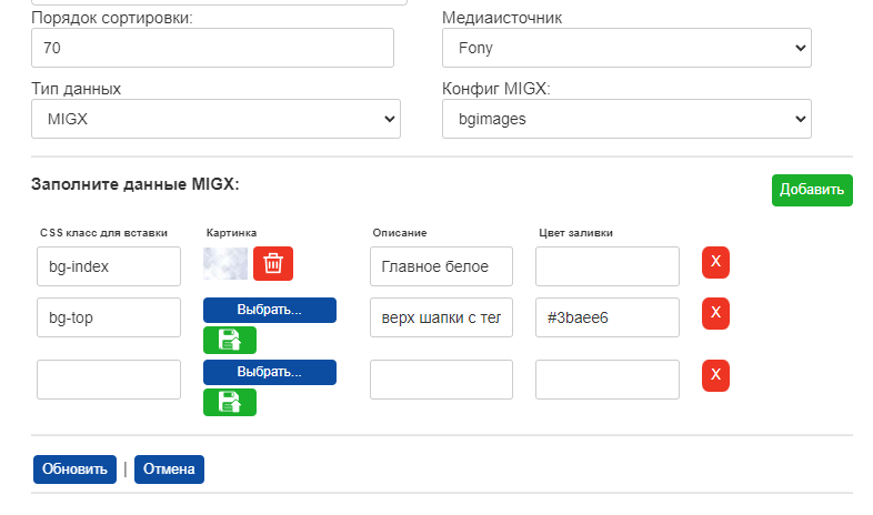 Set CSS class, optionally upload image, description, color as
 #ff0000orrgb(100,50,0). An existing element class will get this pattern. Best for large blocks. To add: choose image, upload (it goes to the server and can be removed). Green Add adds a row. X next to a field removes that row. Click Update to apply. Cancel discards changes.handyshop_text_font – font size and line height. CSS format, e.g. 16px. Default line height ~1.5; better set explicitly 16px/1.5. Default 14px/1.5.
handyshop_font – font family. List in order of preference. You can use a Google Fonts font name.
handyshop_btns_radius – global button border radius.
handyshop_bg_position – CSS parameters for the background image set in handyshop_bg_img.
Catalog tab
handyshop_news_id and handyshop_catalog_id – set the main container resource ids for News and Catalog. Some widgets will use these ids to fetch data.
Информация
Functionality will grow with your input. Do not hesitate to suggest features.